About This Case Study
Independent Project for A-Team Auto Shop to enhance and challenge my UI/UX Design skills using Figma, Adobe Illustrator, and Adobe Photoshop.
Featured in this project are eleven hifi website pages and popup designs for the A-Team Tire & Auto Shop that I designed utilizing my UX Design research. To see more of the website and learn more about the process please see the case study below.
Overview and Process
The Original Website
The A-Team Tire and Auto Shop is a local family owned auto repair shop that has served their community for many years.
After reviewing their website I felt that there could be a potential opportunity to highlight shop's business qualities a bit better and a little more user friendly. The target audience for this website would be for car owners and adults from the age group ranging between 21 - 70 years old.
Purpose
If clients are car owners with car issues who need specific services to repair their vehicles than this website would be helpful because it would give them information about the business services, prices, booking appointments, locations, and unique qualities that would benefit both the client and the business collaborating together.
The website provides information on the auto shop's services, history, locations, and additional benefits when going to the Countryside location specifically. This website allows users to learn about the auto shop but the information on the history and the lengthy informational paragraphs of the auto shop overshadows the services it can provide customers/users.
If the client/user can perform the ability to search the auto shop's services and book service appointments online, then they will achieve the repairs needed for their vehicle.
Challenges
User Experience
The website serves its purpose when it comes to giving information about the auto shop however, the presentation and information should focus heavily on the business's service abilities.
Branding
The color scheme, layout, and hierarchy could be improved to show the auto shop is modern, focused on service, but still provides a unique quality of customer service being a family owned auto shop compared to their competitors.
Sitemap
Other challenges would include the sitemap for the user experience that is a bit dysfunctional with the buttons leading to the same pages with lack of organization in information.
Problem Statement
Although the website gives information about the auto shop the main focus should be the services the auto shop provides for the users visiting the website. The following are areas that need improvement:
• Services need to be organized
• Support for customers/clients/users
• Sitemap needs to be clear
• Branding and presentation need to be improved
• Lack of process for booking services
• Hierarchy of information
• Booking services/appointments as the main goal for more potential profit
Solutions for the Homepage and Expansion
• Summarized on the history of the auto shop and create a separate page with more information "About Us"
• Create a modern layout utilizing the company's color scheme
• Provide user with more information on services available
• Improve user experience with booking services
• Improve sitemap
• Organize all information to build user trust in order to book appointments/services
Video Demo of High Fidelity Prototype
Further details of this project's research and process below the video.
The full layouts of these individual pages and popups are also available.
Website Redesign and Expansion
Research to Final Results
Audit Research
My research included auto services from small and large companies. In addition I researched Nothing Bundt Cakes, not only because they are delicious, but because they also provide a service to clients with their baked goods. Selling multiple variations of product and providing the service of having a fresh baked good ready at a client's conveniency.
In my findings I found the branding, presentation, and sitemaps to be clean, modern, simple, and had clearly communication. The websites directed clients/users to their services and abilities immediately when visiting their websites.
Information Architecture
The Original Sitemap Research
Although it may appear to clearly communicate the information on the homepage the buttons to direct users to service information and booking appointments are no where in the same area.
The importance of services the auto shop provides are also not the main focus within the organization.
In order for the business to boost booking services and provide quick information on services this needs to have better organization and hierarchy within the homepage.
The Revised Sitemap
The revision focused on organizing the experience for users to clearly locate more information that they may find interesting based on their interactions of the homepage. The sitemap also may now influence the user to follow the navigation in order to reach the end goal of booking an appointment with the A-Team auto shop.
Each section provided in the homepage will redirect the user to more information or booking an appointment creating a higher success for both the business and user.
Sketching and Ideations
Concepts of layout for homepage redesign created using markers and whiteboard.
Listed in red ink are the ideas that I wanted to address and merge into the layout sketches.
Both sketches were important in reaching the low fidelity layout that highlighted the solutions that needed to be incorporated into the new design.
However before moving forward into the LoFi design I needed to do research and audit competitors that were direct and indirectly related to this specific service.
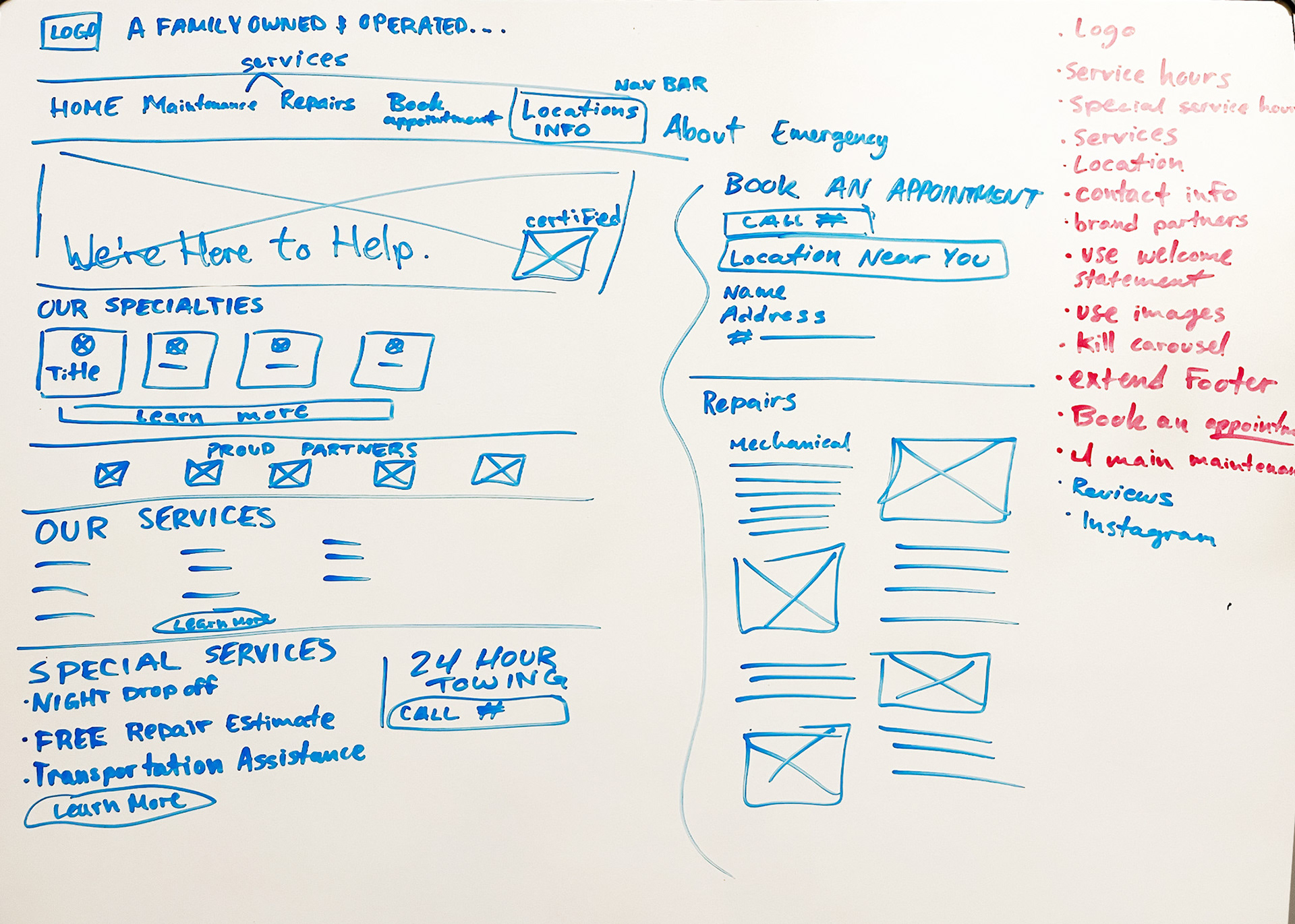
Sketch 1
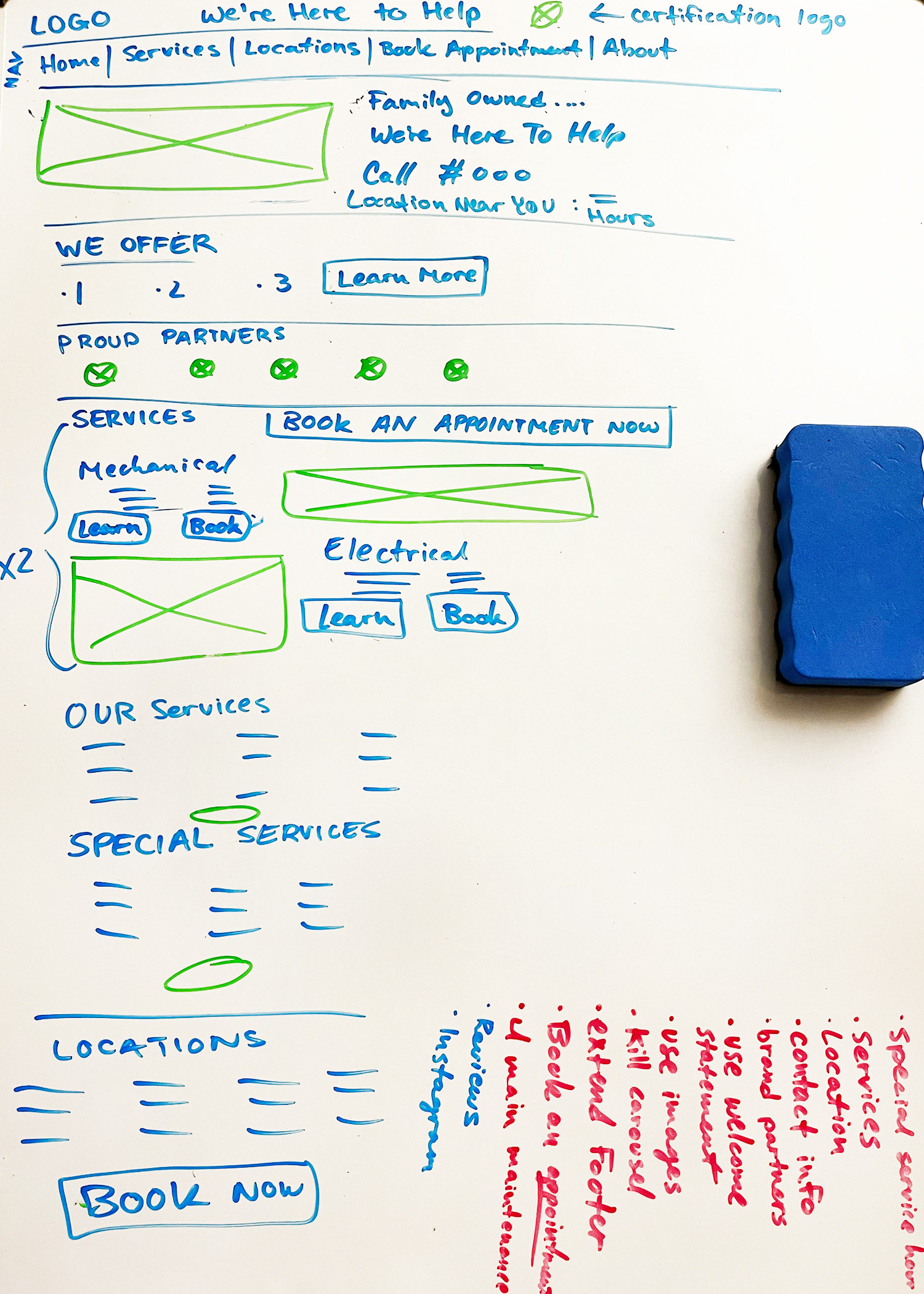
Sketch 2
Paper to LoFi Design
The focus during this phase remained on the user being able to find information on services, booking an appointment, and creating content hierarchy that was organized with clear communication. During my research of other websites I found it important to also utilize images and icons throughout the website.
I was able to create this LoFi design in Figma and used the color purple to signify buttons and images that will be used in the layout.
After creating this low fidelity prototype layout I was able to understand the improvements that were needed and how branding was going to be incorporated in the high fidelity design.
Mood Board
Inspiration in moving forward with the website high fidelity redesign was influenced by the focus on branding, color, competitor styles, and the target audience using the website.
I wanted to stay true to the colors used in the company's branding with additionally adding a few colors that would not create visual competition or imbalance with the main colors of yellow, black and white.
The original website was also a main inspiration in the layout and determined what information needed to highlighted more or less. The website gave a good idea as to how the layout should be reconstructed and what experience I wanted the users to have in the revised website.
HiFi Designs For Website
Addressing the Problems
The solutions that were the main focus were incorporated into the HiFi design for the homepage website. This included balancing the branding, content hierarchy, interactive guidance for booking appointments, and information on services the auto shop provides.
In this layout I wanted to also create a strong contrast between information of services the auto shop business provides to visually capture the user's attention when interacting with the website.
Why It Matters
If the client/user can perform the ability to search the auto shop's services and book service appointments online, then they will achieve the repairs needed for their vehicle.
As a small business it is important to incorporate modern style layouts, branding, and create visually appealing experience for user experiences to create success for both the business and the clients/users. Although the original website has functionality it is not showcasing the business's qualities to the best of its ability. It also does not guide the user on next steps to book services with the auto shop.
Using UI Design skills I have created stronger visual hierarchy, organized information, and created a better visual guide for the user experience.
Throughout the homepage the user can now learn more about the auto shop's services, contact information, business details, and so much more with organization. In addition it has now increased a higher chance for the user to book an appointment after reading the information they are searching for online which is not included in the original website.
Why Should the User Care
Faster Communication
The user has an easier ability to scan through the organized information, quicker access to booking an appointment with the auto shop, and has business detailed information such as hours, locations, and reviews available compared to the original website layout.
Branding Creates Trust
The confidence to use a modern looking website is also valuable to the user and the business. The modern branding style, usability, and organization will give a user confidence that this small business has empathy for their clients and their experiences whether it be online or in person the client's experience is valued. In addition, the quicker the experience to locate information online the more confidence the user will have to booking an appointment with the business.
User Experience Matters
Creating more opportunities for the users/clients to interact with the website will increase booking appointments with the shop because of an improved user experience that has information hierarchy that is organized pertaining to the users/clients needs that the business can provide. I was able to introduce more buttons, sitemap improvement with navigation bar, and separate sections of information to improve the user experience when navigating through the website. The goal is to have the user receive the information they need in order to feel confident in booking an appointment with the auto shop to receive vehicle repair services.
How Success Is Determined
Determining the success in this new HiFi redesign of the A-Team Auto Shop website will be determined by how much of an increase the business will have in booking appointments online.
High Fidelity (Hifi) Designs of Website Pages
Eleven website pages and popup designs
Pages include: Homepage, Services (All Services), Individual Service Pages, Locations, About, and Contact Pages
In addition I developed a few popup screens to help with online customer service and information.

Homepage

All Services

Maintenance Services Page

Customer Service Assistance Popup
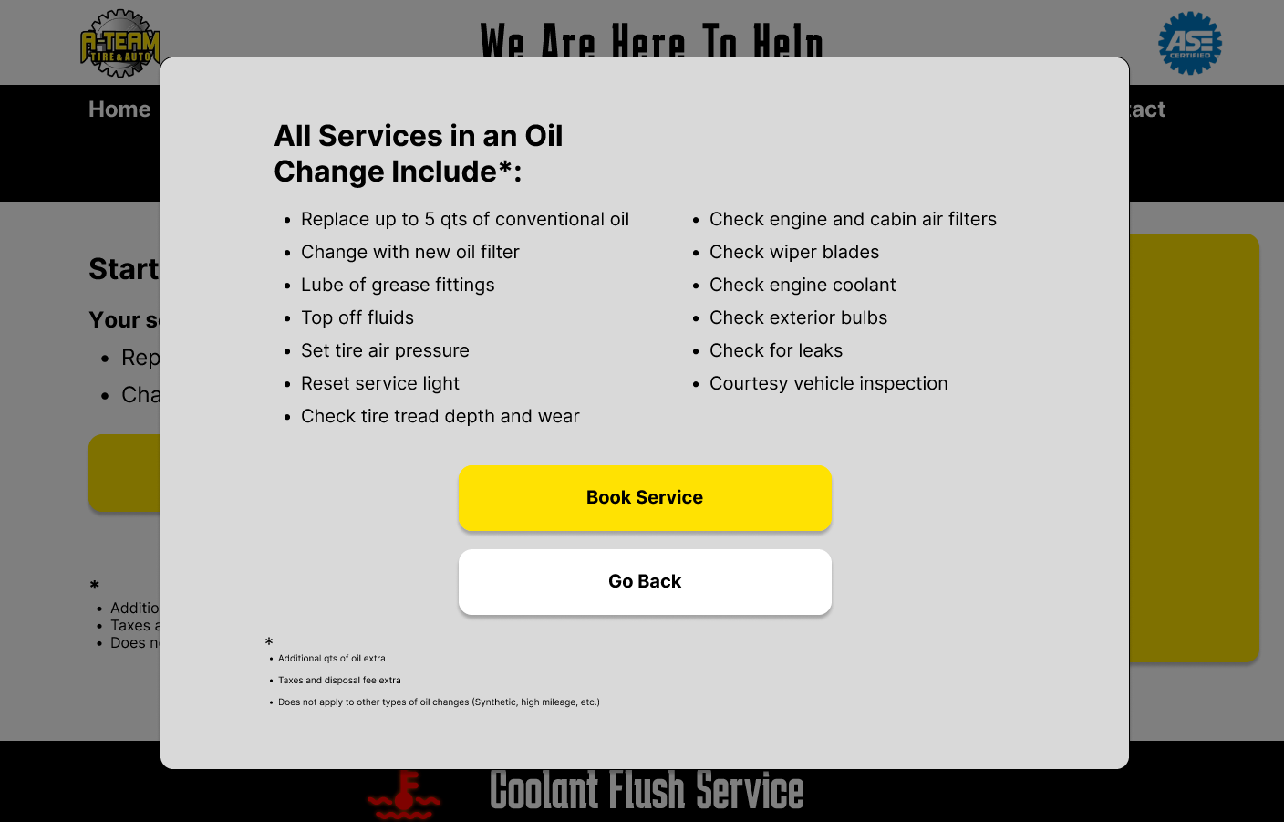
Learn More About Service Popup
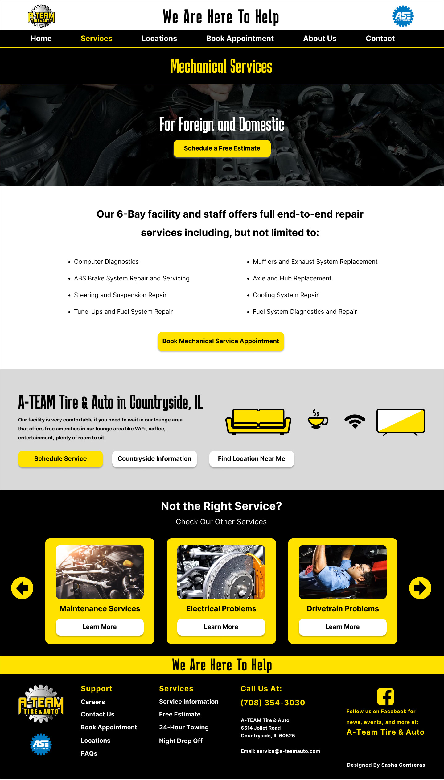
Mechanical Services
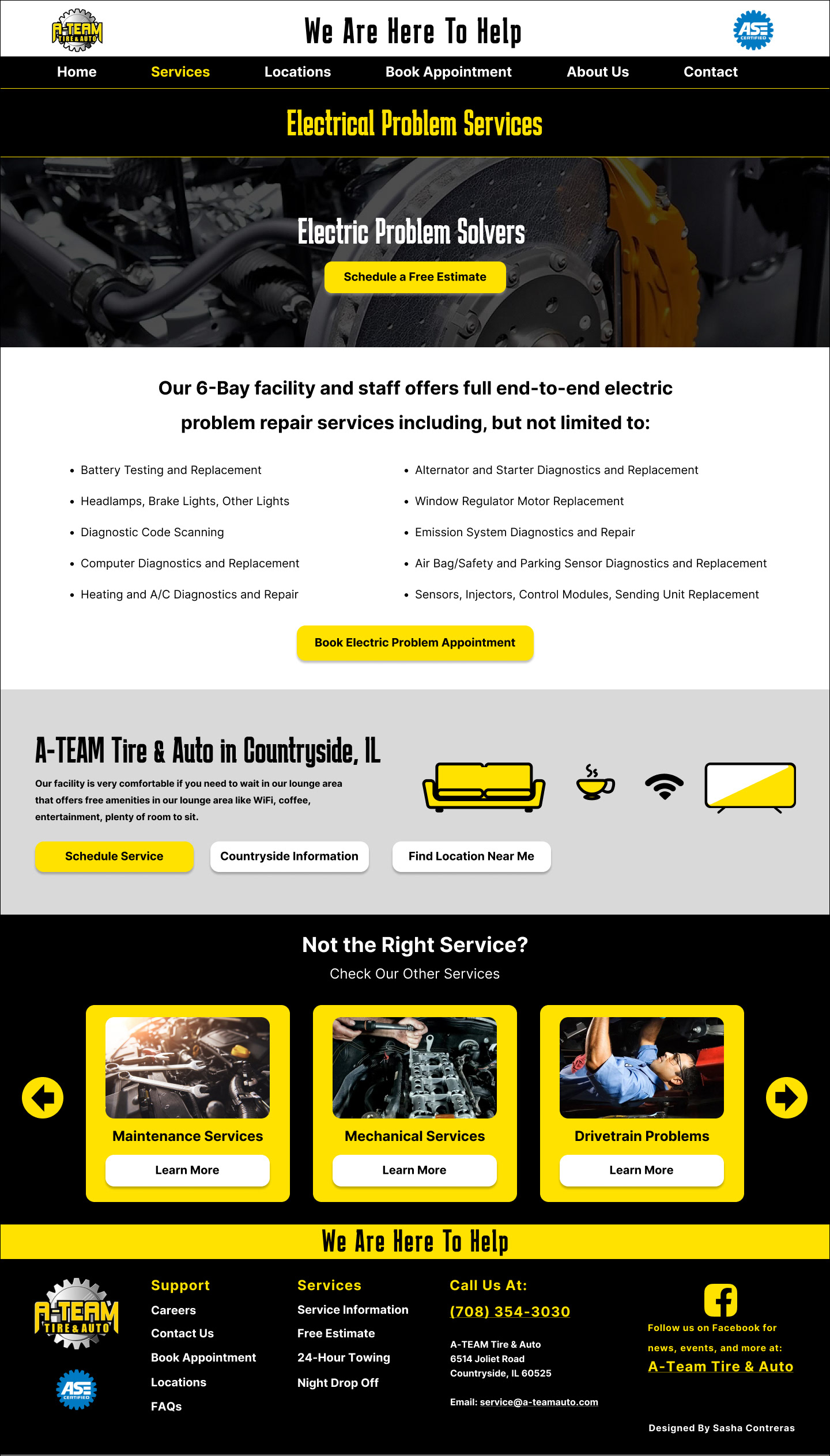
Electrical Problem Services
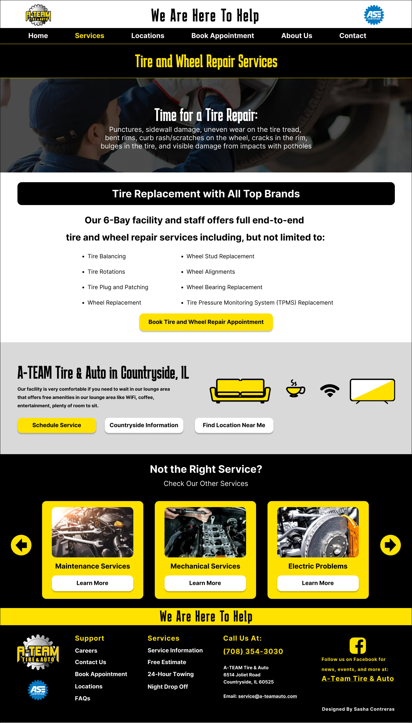
Tire and Wheel Repair Services
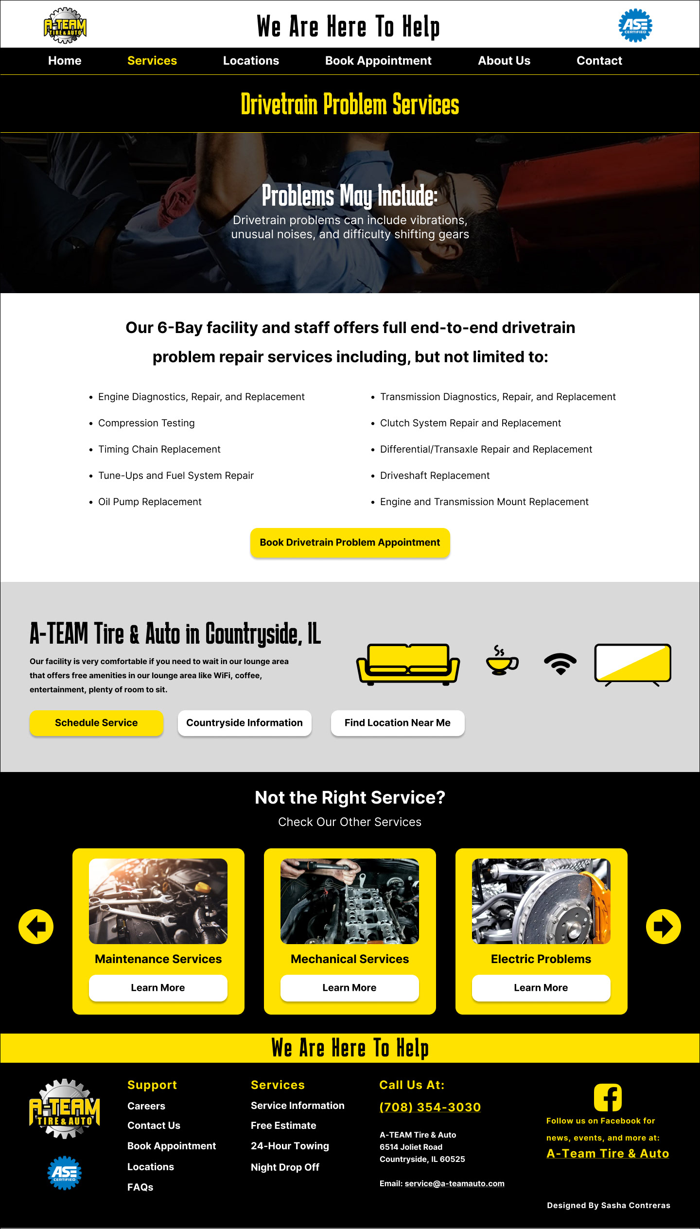
Drivetrain Problem Services
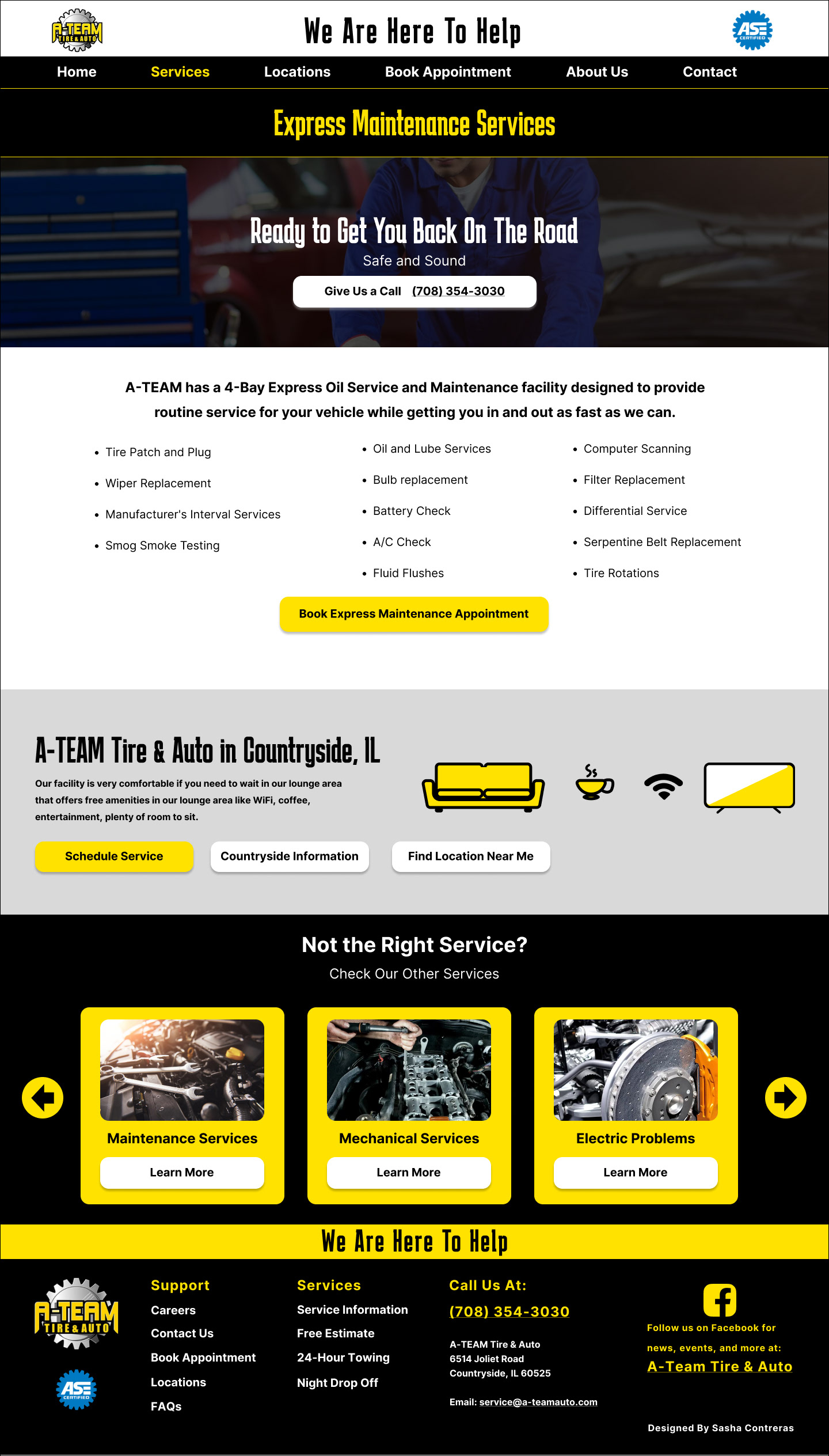
Express Maintenance Services
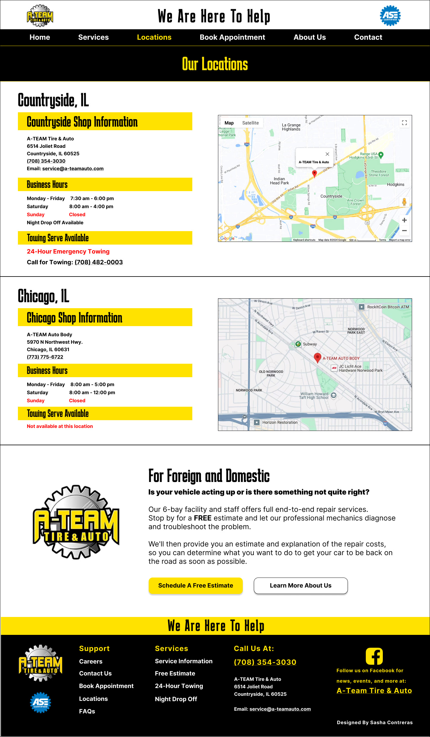
Locations Page
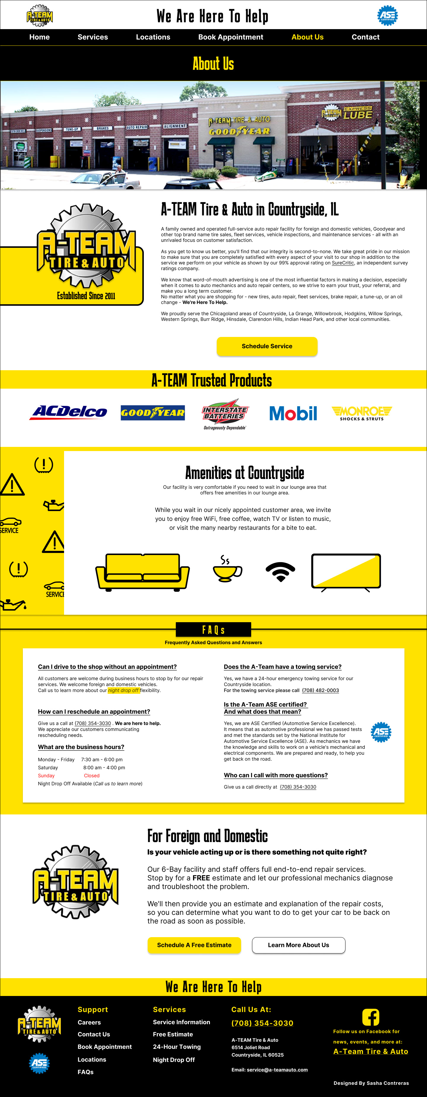
About Us Page
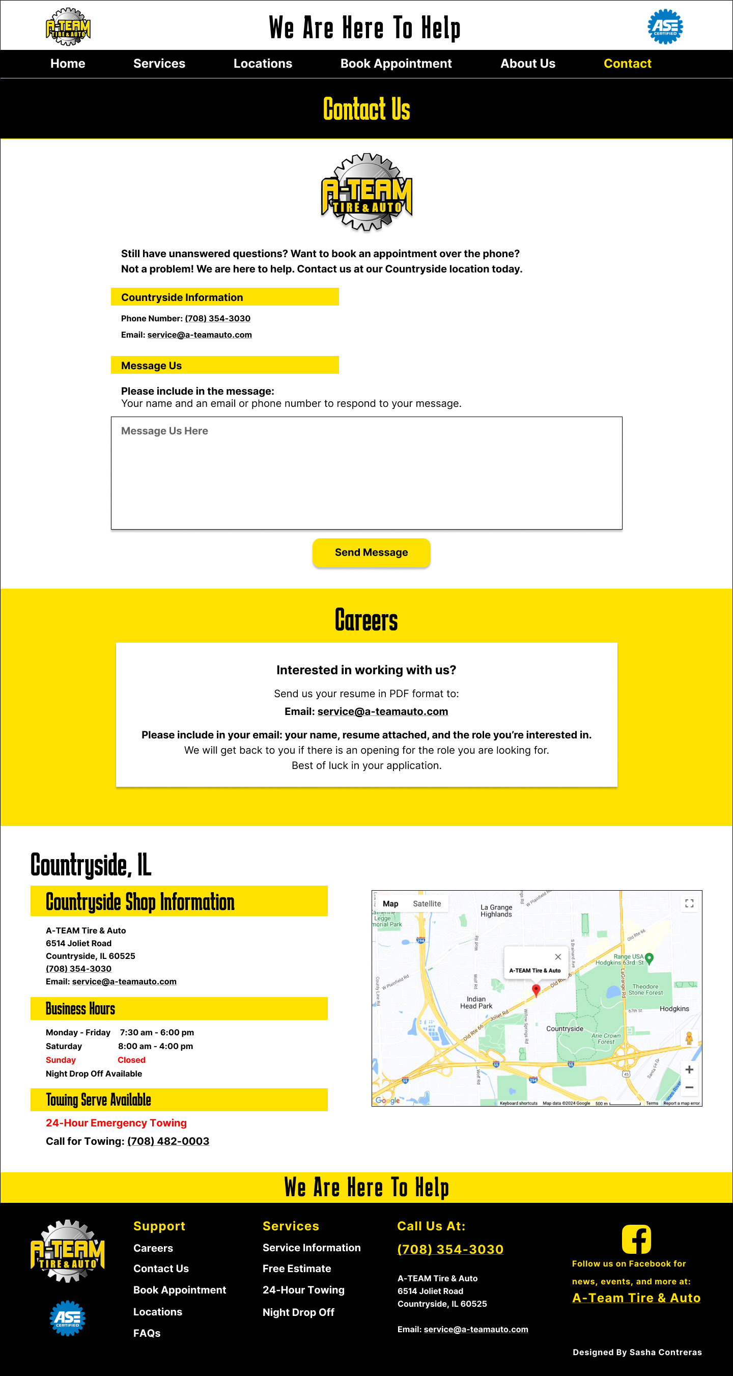
Contact Page
Findings and Conclusion
This was a great learning experience for me to redevelop the A-Team Auto Shop website as a personal project. I personally enjoy supporting small businesses and hope they are successful.
The project helped me to understand how user experiences in this case needed to be easy for various users and age ranges because of the age range of car owners. The A-Team website was also an example of a functioning website with strong content but needed more attention to the information organization, user experience, branding, and to highlight the need of the user to be communicated faster.
I feel that with the changes I have suggested in this redesign homepage of the website that the business should have a higher success rate in booking appointments and for users/clients to search for information they need with ease.